|
Graphics should be used to show real content, not
just to decorate your homepage. As the website has to attract
students and academics, it would be beneficial to have pictures
that would relate to each group of users such as a picture
of a student on holiday to attract students. When deciding
upon graphics and animation it is also imperative to take
into account the download time. A common rule is that users
become impatient if the page does not load within a relatively
short time on a dial up modem. This was also established in
the focus groups and interviews that were conducted. The pages
should therefore contain minimal graphics to avoid long download
times and distractions.
Animation is a very powerful tool that can attract
users to a specific part of the page and convey information.
It however has been found to distract, mislead and aggravate
users if used improperly. This produced a problem, for if
one part of the page contains animation, it will distract
the user from the rest of the page. Furthermore, as the website
is aimed at three distinct categories of users, animating
information for one group would distract the attention of
the other two groups. It was therefore decided not to have
animation on the site.
Colours: A common mistake with web design is to
use colours inappropriately. If the foreground and background
colours have too little contrast between them, the text becomes
unreadable. The best contrast is black text on white background.
Black on white was implemented originally, but the staff at
ABC requested for a shade of blue as the text colours to resemble
the company colours. Blue is generally used for a background
colour however due to the eye being most sensitive to it.
The darker blue was therefore chosen as the text colour. This
colour has proved to be acceptable when tested on a colour-blind
user. As the page is a fixed width, a light blue colour was
chosen as the background to generate a comfortable and relaxed
feeling.
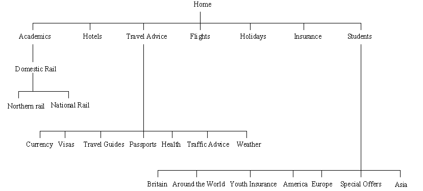
Site Layout
|